Let’s say that we are using Bootstrap framework and we need some changes in our content related to device screen size.
We may have 2 div boxes which are alongside in wide screen, and one on another in mobile screen.
In such cases some texts in our content may be unclear.
For example
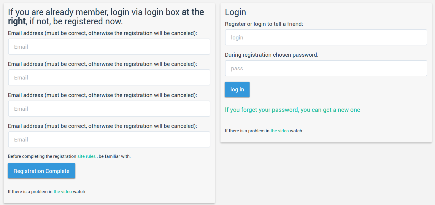
See the bold text in the example. It seems ok now. But if to open same content in mobile device we will get
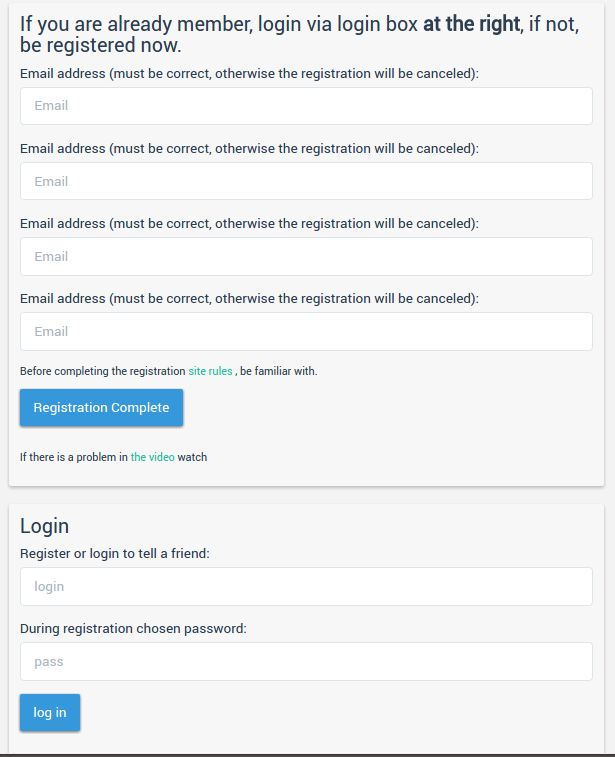
You see, in this example the text “at the right” is inaccurate. As it is the only problem in this case, we don’t need to create another div for smaller screen. We just need to set responsive text there. Let’s do it:
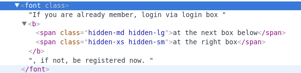
We just change “at the right box” to “<span class=’hidden-md hidden-lg’>at the next box below</span><span class=’hidden-xs hidden-sm’>at the right box</span>”.
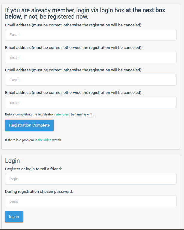
What we will get let’s see
in wide screen. And
I think the main principe is clear. With such little tricks we can escape serious html restructuring in most cases. We can do this trick even in WordPress text editor. So there will not be any need to edit theme files to adjust device sensitive texts.